Is your landing page not converting as well as it should be? Is the bounce rate higher than you expected and the conversion rate lower than your industry benchmarks? This calls for playing detective to find out what’s coming in the way of your conversions, how about doing this via a 100-point landing page audit checklist?
As a content marketer and strategist for Instapage for over a decade, I have been living, breathing, and munching on landing pages for years. I know what landing page optimization looks like. And if your landing page is underperforming, you’ve come to the right place.
I’ve created a handy landing page audit checklist for you to assess your page’s effectiveness. The more checks you have, the better. As a bonus, this post also includes some examples of optimized landing pages that pass all the checks so you have visual inspiration.
The checklist is divided into sections, so it’s easier than ever to score your page. There are a total of 100 points, aim to get a score of above 90%, but above 85 is also a good starting point.
Something to consider: This is not a long blog post featuring 110 landing page examples, or an article going over the why and how of optimizing each landing page element. If you want to learn about those, read our landing page optimization guide or look into landing page performance metrics here. This is a no-BS, no-fluff optimization audit checklist that will help you see if your landing page passes the optimization best practices test within minutes.
Is your landing page headline optimized?
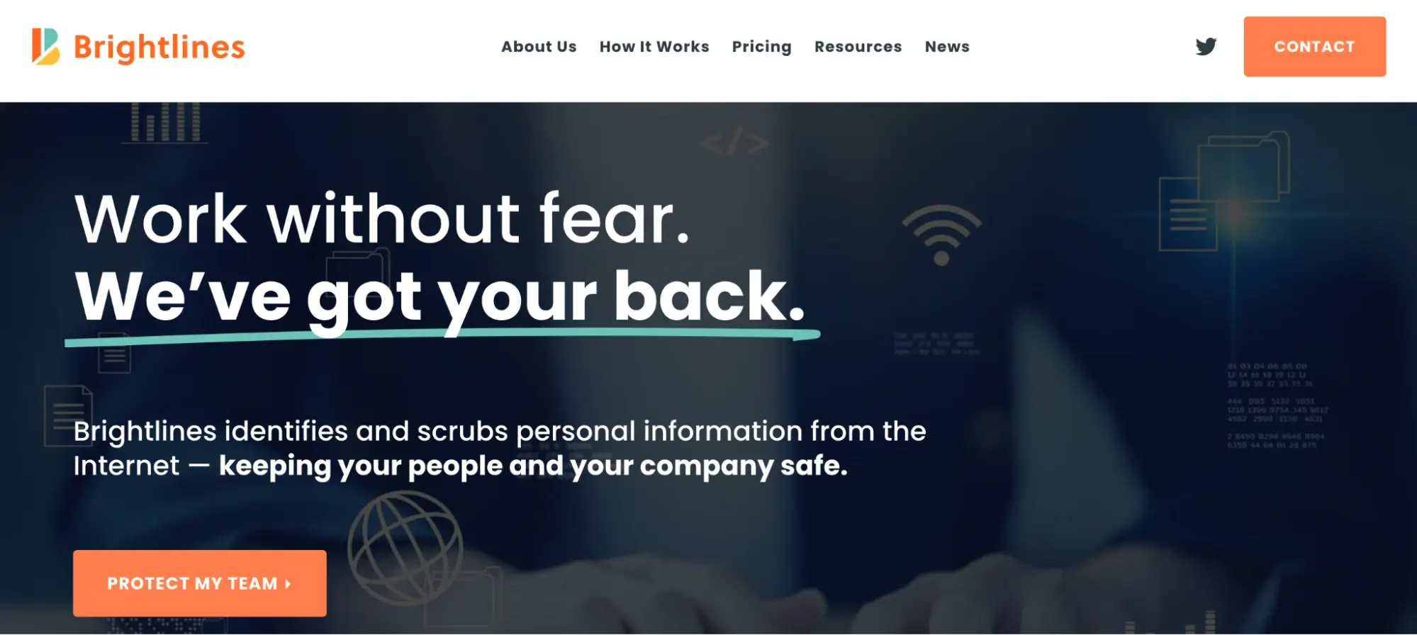
The Brightlines landing page headline explains the “what” behind the service—by answering the primary thing that the service performs for customers. The headline is the biggest thing in the hero section and the colored underline focuses on the trust factor. The sub-headline follows through with the “how” of the service, and the bold font showcases Brightline’s primary UVP.
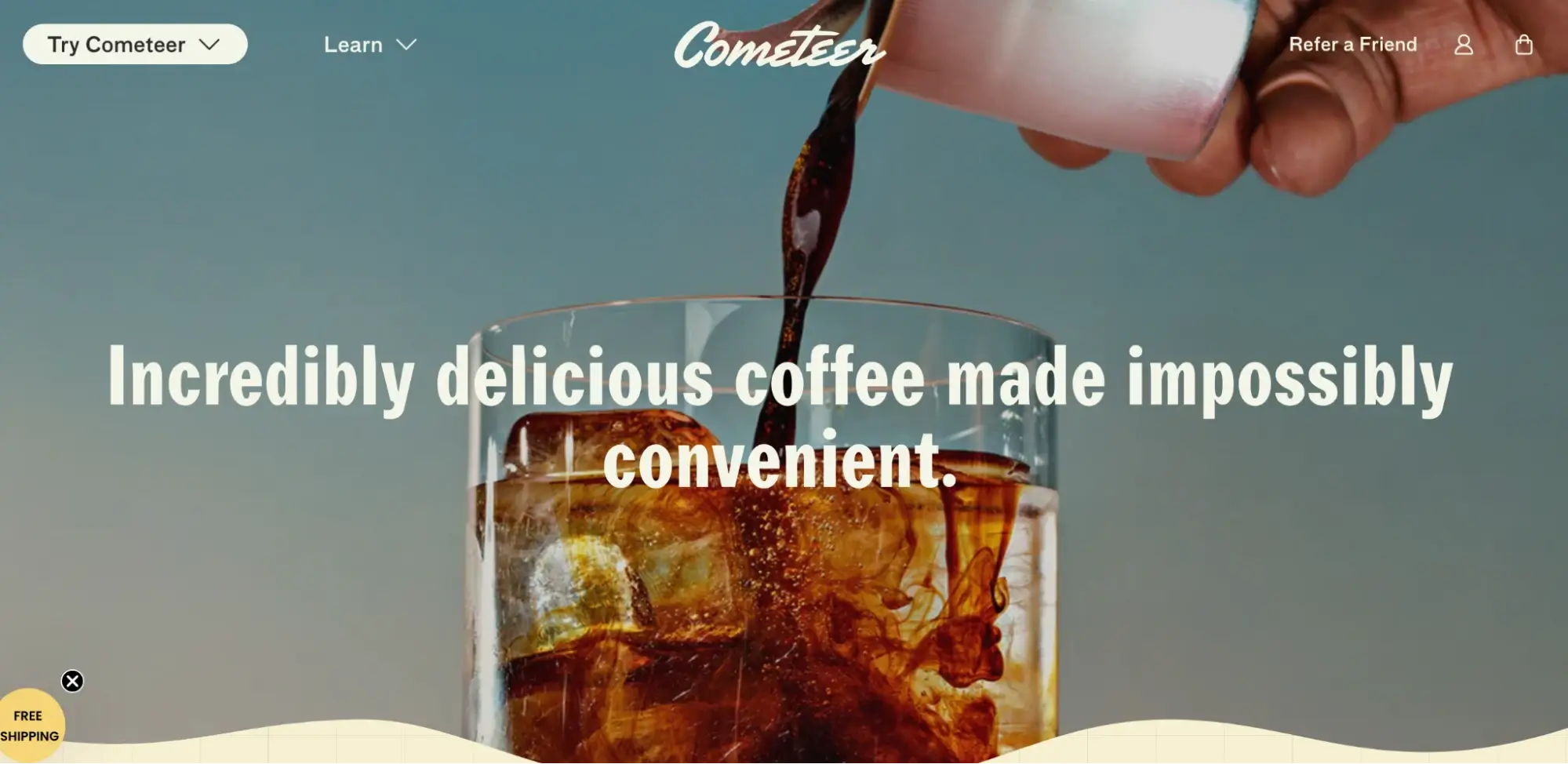
The Comteer headline is blunt and clear, it explains exactly what the product does and how it makes users’ lives better. It’s placed in the center of the hero section in large font, making it the star of this page section.
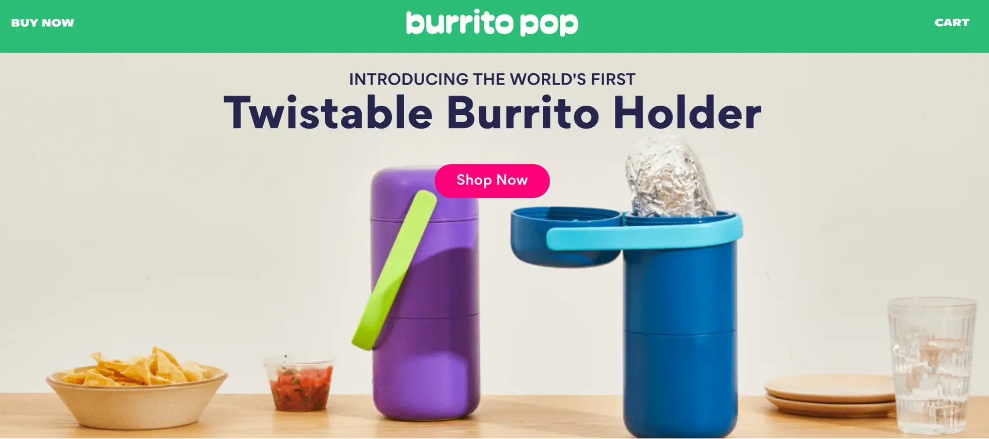
The Burrito Pop headline works for disruptor brands that are introducing a new product in their category. It’s a simple phrase but the “world’s first” claim gets the job done.
The Flaus headline explains exactly what the product does: it’s an electric flosser that makes smiles accessible for everyone. While the sub-headline mentions user segments who would benefit from buying the product. The big bold white letters on the pitch black background image, make the element stand out.
Is your landing page design optimized?
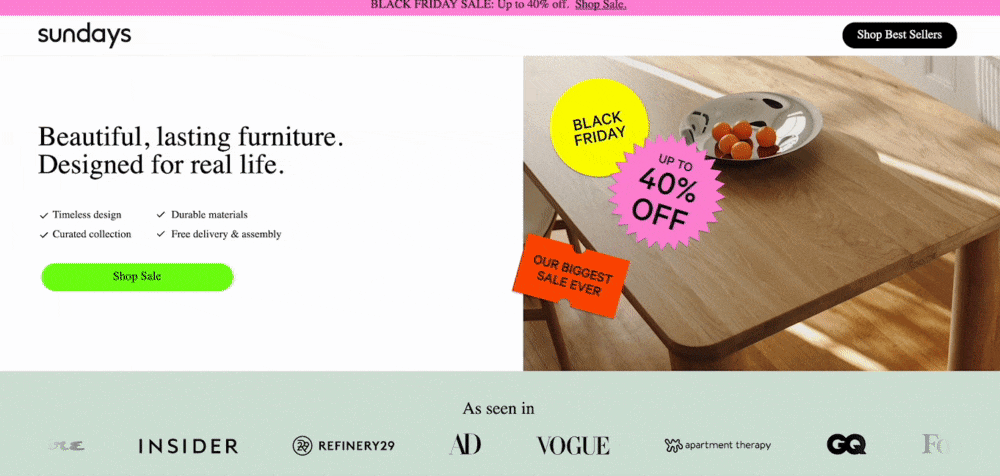
Sunday’s landing page checks all these boxes—the page design is clean, all the elements have room to breathe with ample white space around them, the page loads quickly, and the sections are placed in a logical order. There are no external navigation links on the page, no disctractions, and absolutely no borken links.
The page sections are designed in multiple colors, there are lifestyle images on the page, product shots, and drawings.
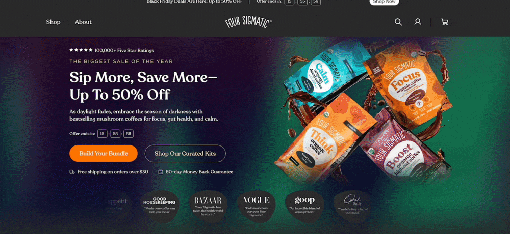
Four Sigmatic’s page is the same—each section is designed like a mini page that convinces the user shop the coffee. From customer testimonials, the competitor chart, to the build your own box section, every element is meticulously designed and perfectly optimized.
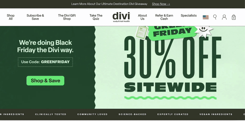
The Divi landing page doesn’t feature contrasting color sections like the other examples, however, every section does what it’s optimized to do. The customer testimonials instill social proof, the product images show visitors exactly what they are getting, and the review section gives a detailed snapshot of customers’ experiences and there are ample CTA buttons present on the page, for whenever the user commits to purchase the hair care product.
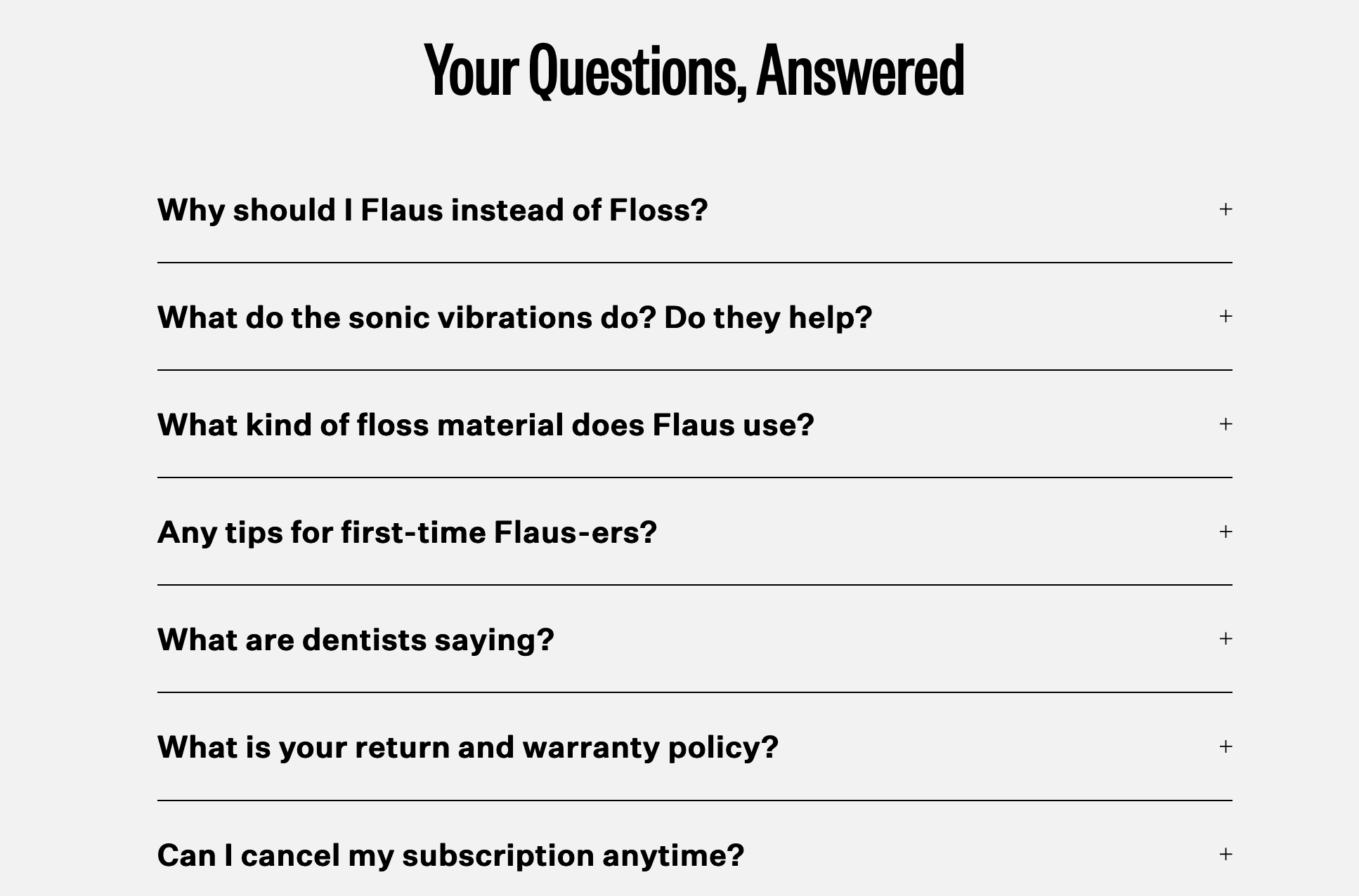
On the Flaus landing page design, the element that stands out is the collapsable FAQ section—it doesn’t take a lot of space and gives answers to potential user objections.
Is your call to action (CTA) button optimized?
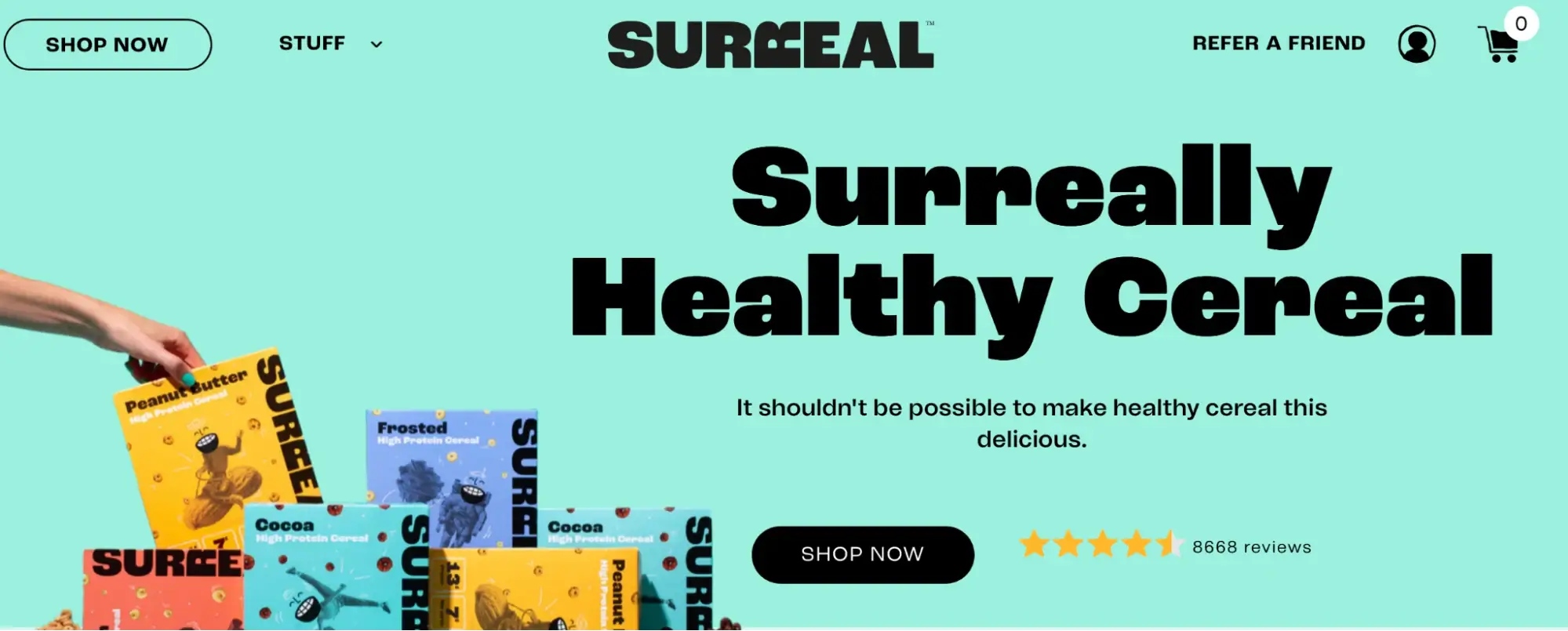
The Surreal CTA button color contrasts with the page and it is placed near customer tally numbers for social proof.
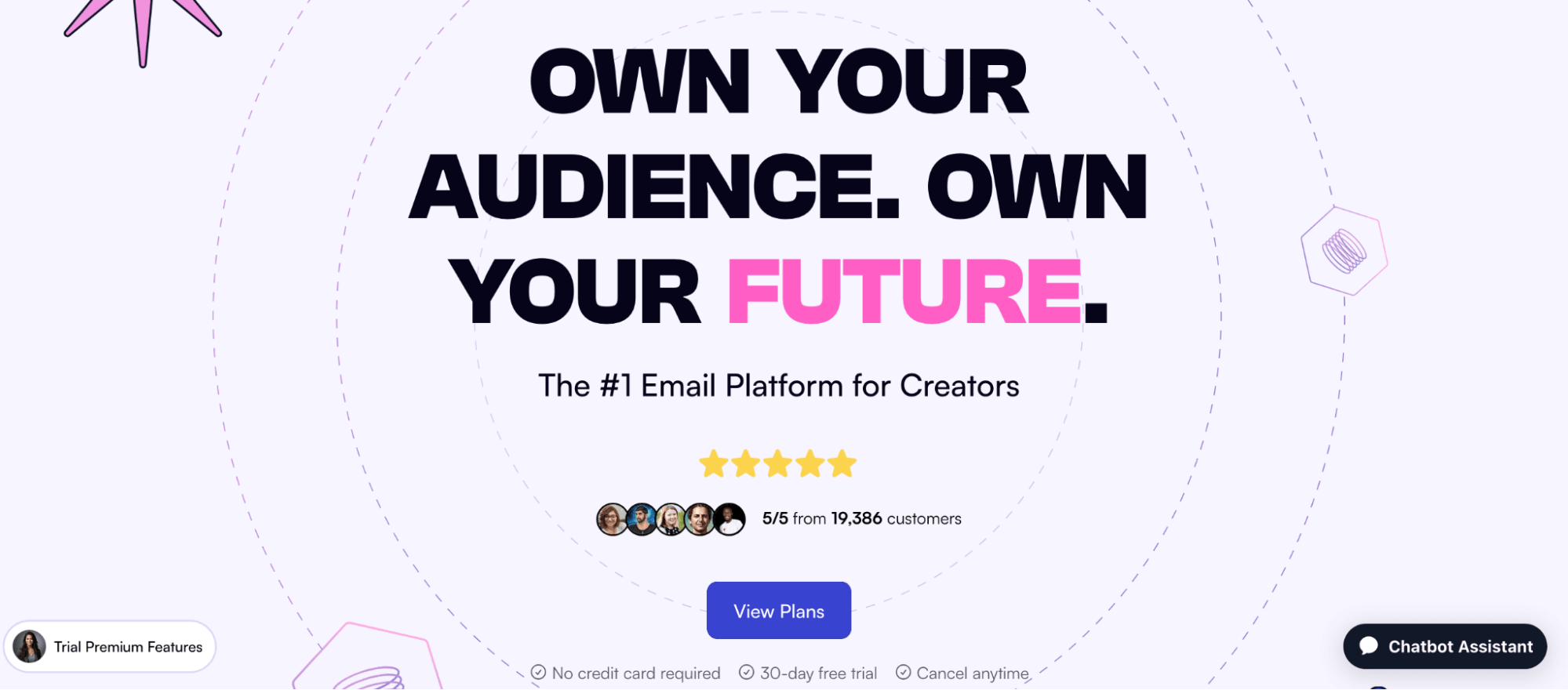
The Behiive landing page CTA button tells visitors exactly what will happen once they click it i.e. they’ll be able to view pricing plans. The CTA button is also designed in proximity to the customer tally and reasons why visitors should avail the offer, “no credit card required. 30-day free trial. Cancel anytime.
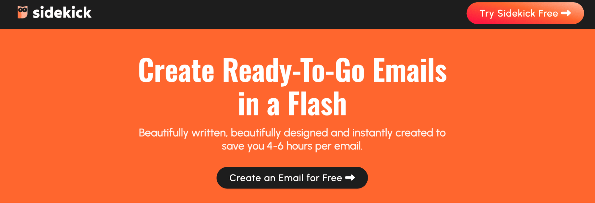
The Sidekick CTA button contrasts with the background page color, it’s orange on the black bar and black on the orange hero section. It tells visitors the next action they need to take, “create an email for free” so they can try the email platform.
Is your landing page form optimized?
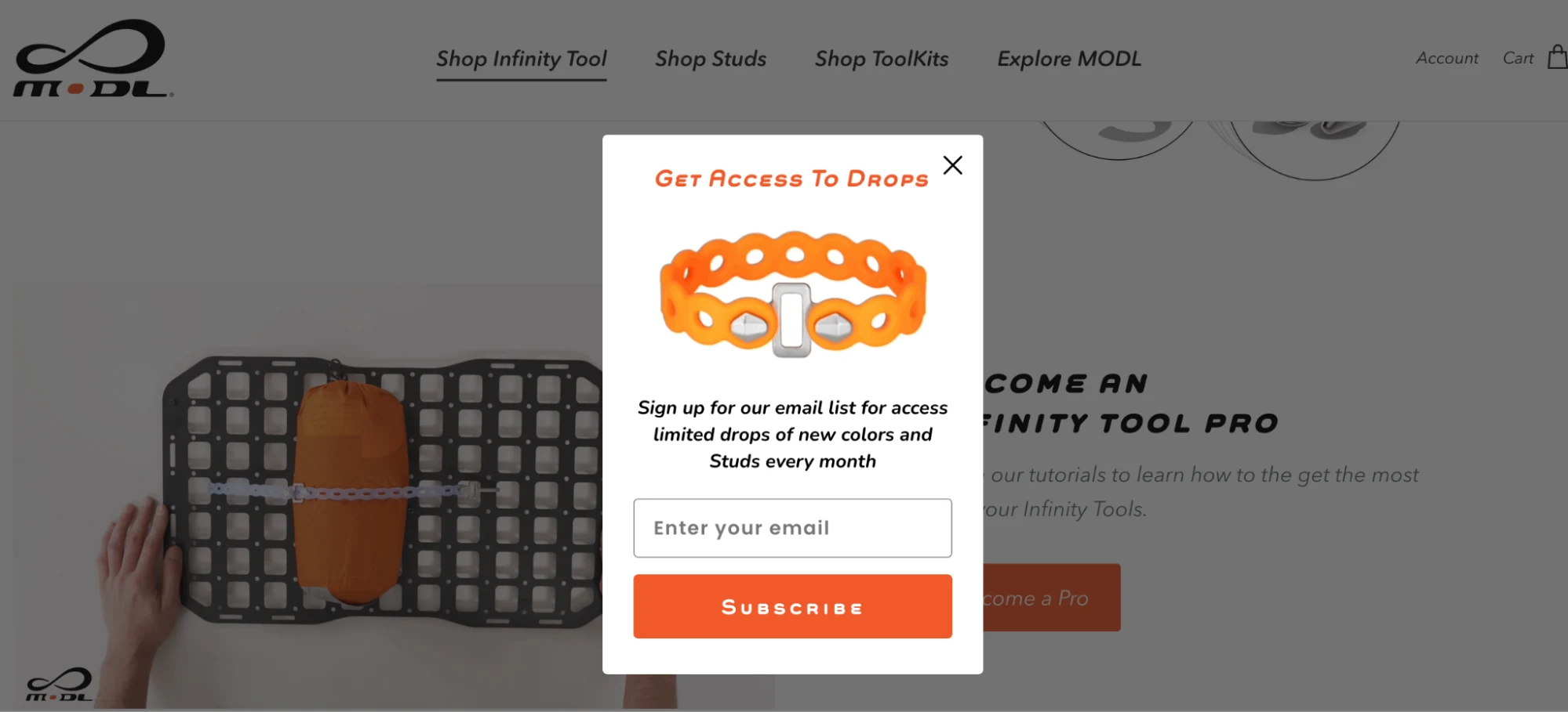
The length of your landing page form depends on the offer you’re promoting on the page. If you’re asking visitors to sign up for a free newsletter, your form length should be tiny. MODL does this right, when asking visitors to sign up for their email list to access product updates and discounts, all they ask for is the email address.
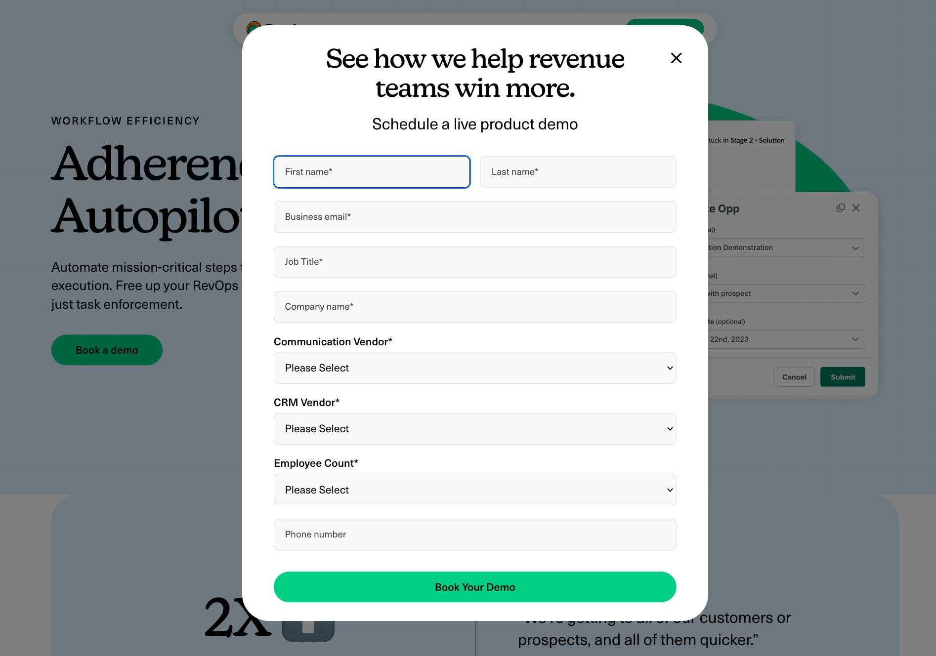
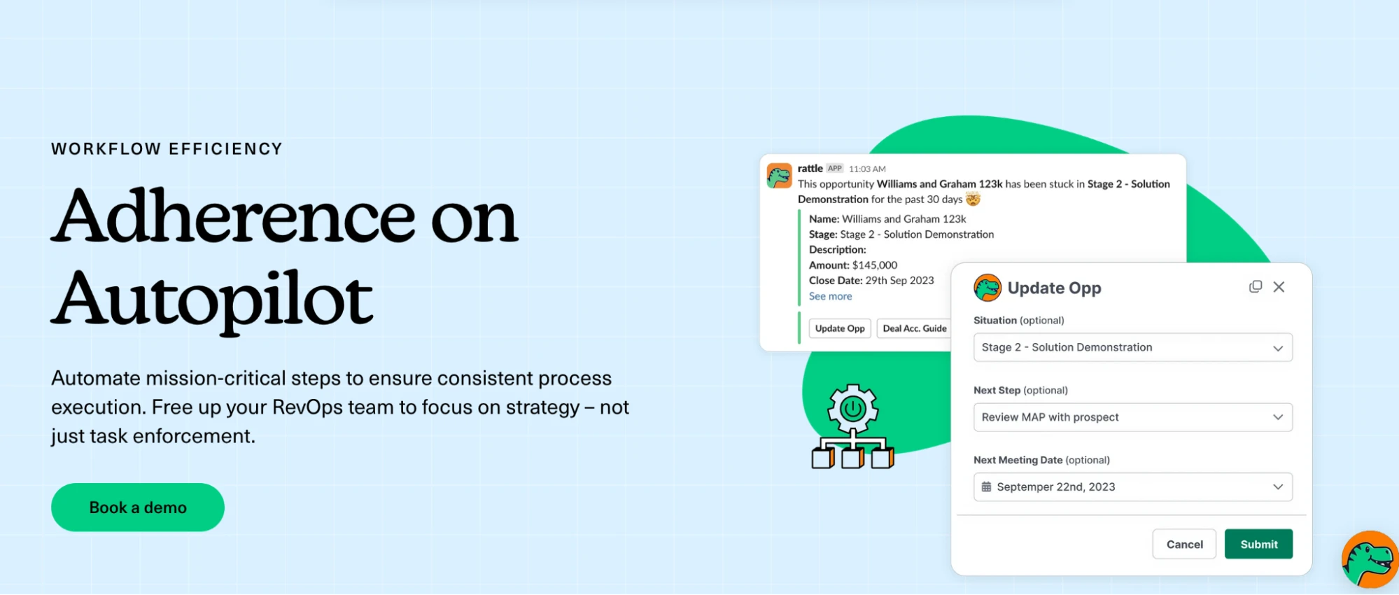
Whereas the Rattle landing page has a relatively longer landing page form since what they’re offering is a free product demo. The form is designed as a pop-up with a headline that reiterates the benefit of using the task management tool—the fields are also easy to fill out with expandable options to help visitors select their chosen option without having to type out everything.
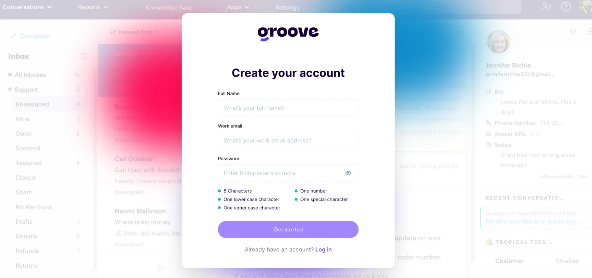
The Groove landing page form asks visitors to only fill out three fields if they want to sign up for the free trial.
User experience
The Skinny Confidential landing page has accessibility features as well as clearly defined categories on the page which help visitors navigate through the page easily. There are no popups on the page, the target audience is featured everywhere, and the each page section comes with its own CTA button.
The Rattle landing page also follows all user experience best practices—with page sections featuring stats, customer testimonials, product screenshots, and a chatbot that can answer any user objections.
The Nguyen landing page also checks all the boxes for the user experience best practices.
Social proof
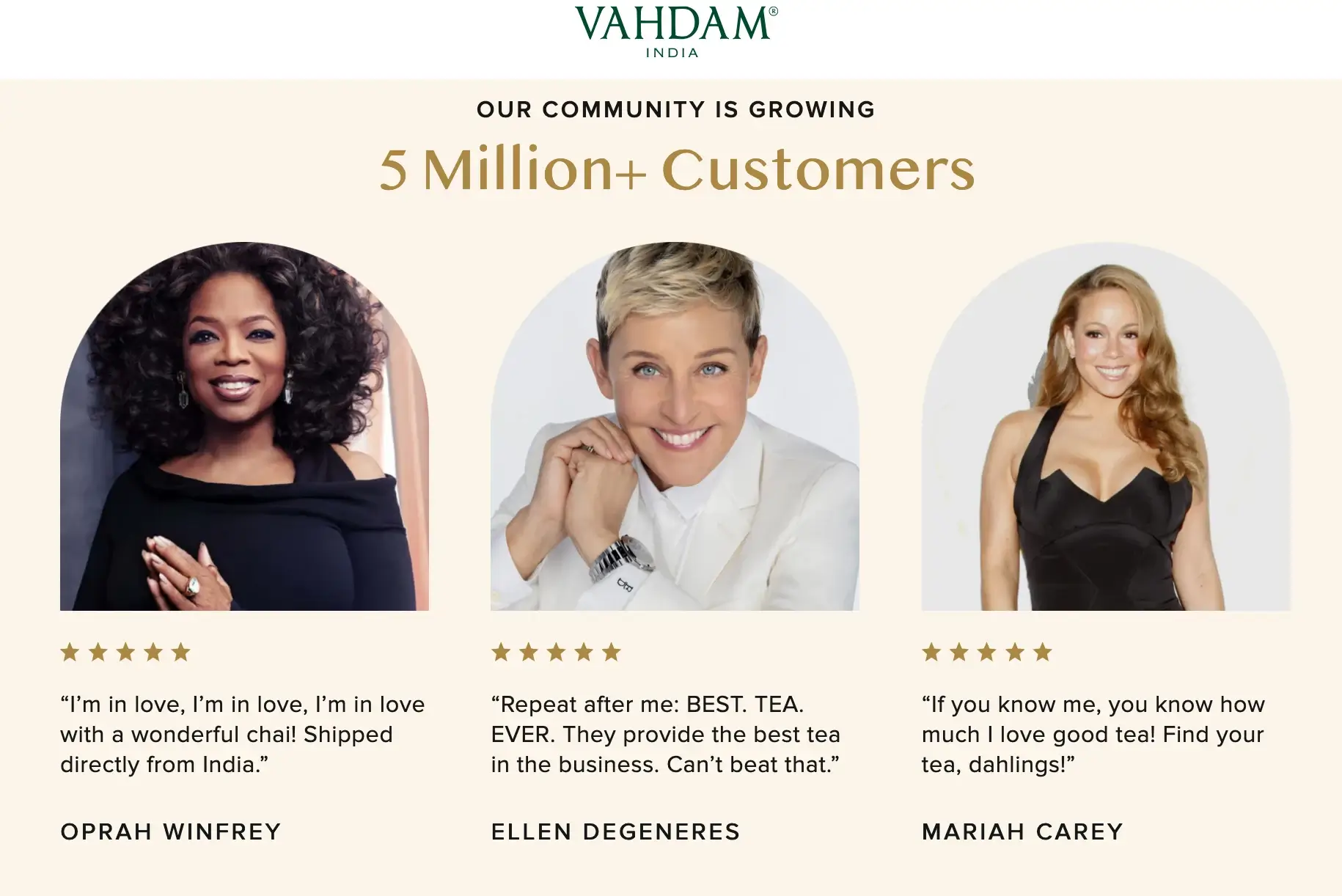
The Vandham landing pages features 5 star customer testimonials from big names like Oprah and Ellen along with an impressive customer count of 5 million+.
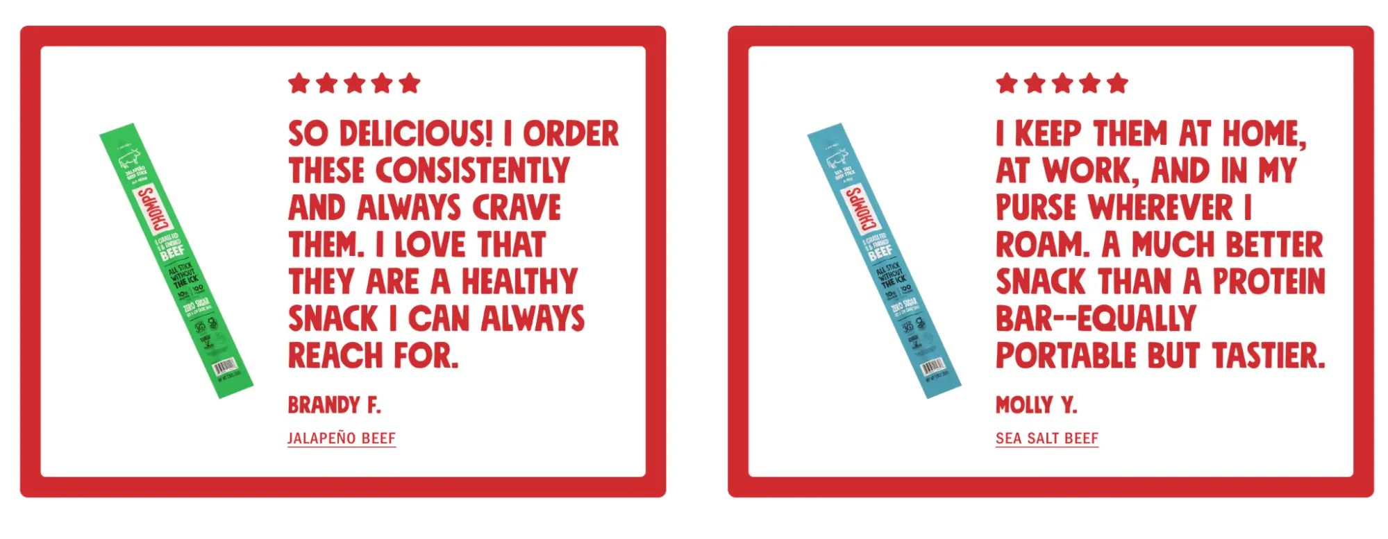
The Chomps landing page features customer testimonials alongside the flavor of the beef jerky each user is raving about.
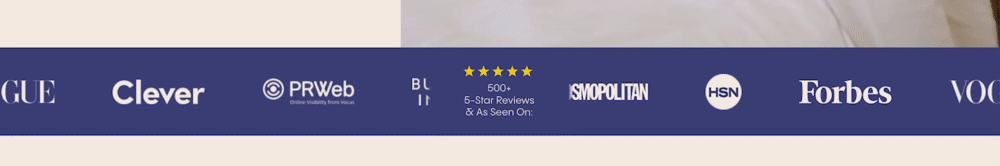
The FluffCo landing page has a banner that features customer badges from notable companies as well as a badge highlighting their 500+ 5-star reviews.
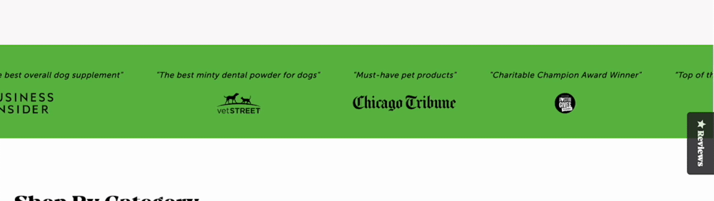
Pet Honesty features press snippets on a banner as social proof.
How does your landing score on the optimization audit checklist?
There you have it folks—a complete optimization audit checklist for your landing pages. Go through the list one by one and start checking things off to see where your landing page stands.
And if you need optimization help or just want to build better, more beautiful landing pages try Instapage.
Instapage makes it easy for you to build personalized landing pages for each audience segment, ensuring consistency from ad click to conversion. Sign up for Instapage 14-day free trial to create highly personalized and optimized landing pages.
Try the world's most advanced landing page platform with a risk-free trial.
Fahad is a Content Writer at Instapage specializing in advertising platforms, industry trends, optimization best practices, marketing psychology, and SEO. He has been writing about landing pages, advertising trends, and personalization for 11+ years.
Ready to turn more ad clicks into conversions?
Try the world's most advanced landing page platform today.
We use cookies to give you the best experience on our website, deliver our services, personalize content, and to analyze traffic. By continuing to use our website you agree to allow our use of cookies. To know more please refer to our Cookie Policy.